
Deliverables and Role
Vision, Web Strategy, Concept Development, Interactive Prototyping, Content Strategy and Design.
Senior Designer in team of four Designers, Creative Technologist, Executive Creative Director, and PM at argo. Client stakeholders at New York Life—CMO, Director of Web Marketing, Director of UX, Senior Designer, PM
The Ask
New York Life (NYL) is a 175+ year old Fortune 500 Company, and the largest mutual life insurance company in the country. We were tasked to transform the website from a cost center to a revenue generator.
Specifically, the website should:
-
Make it frictionless and easy to start financial planning.
-
Help people make sense of financial planning for their future.
-
Help current and prospective clients discover relevant products and services offered based on their changing needs.
IDENTIFYING THE PROBLEM
Navigating the complexity of financial products
I led the efforts in synthesizing and developing insights from exploratory customer research and discovered that
-
Prospective clients don't understand the range of NYL's financial products, or how to customize them to address their financial needs.
-
They’re used to shopping online and assume life insurance should be just as easy. As a result, they are weary of consulting with a financial professional.

POSITIONING AND DIFFERENTIATION
We divided work conducting competitive landscape analysis across direct and indirect competitors to develop a market position and differentiation for NYL as a people-based business demonstrating the value of personalized advice in an ‘add to cart’ world.
Navigation/Mental Model:
Choose Your Own Adventure

Ecomm Approach to
Purchasing Financial Products


NORTH STAR VISION
Foster the growth of new and trustful relationships
EXPERIENCE PILLARS
Encouraging
"My household is unique, but there’s a solution here that works for my needs and budget.”
Human
"My family deserves the personalized advice and guidance of someone who cares.”
Actionable
I’m doing this in-between other things, so help me move forward through this process.”
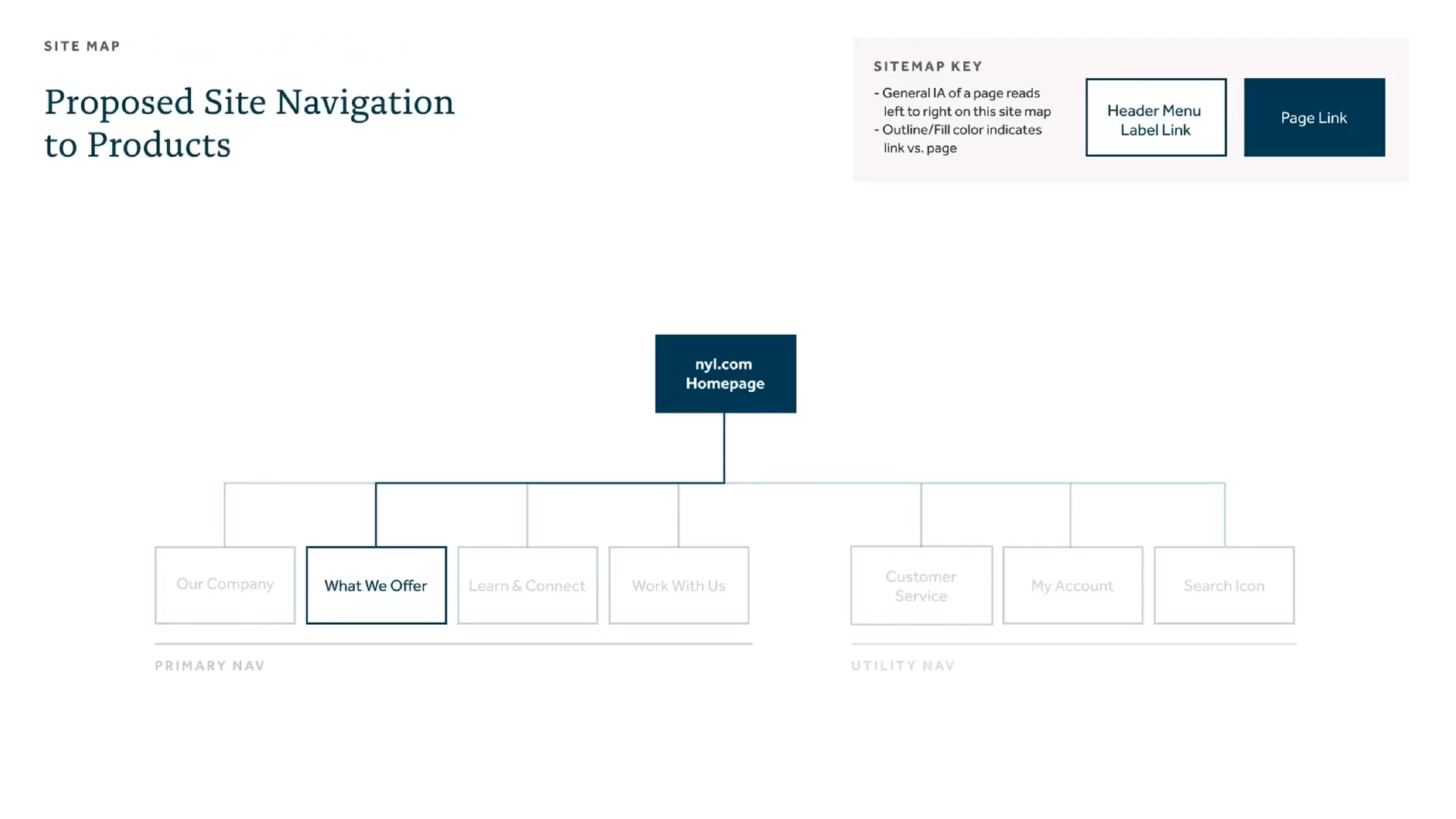
SITE AUDIT
Deconstruct to reconstruct
To understand the core pain points in product research and discovery, I broke down my site audit work around three core vectors of site architecture:
How financial products
were organized
Where they lived on the site
How people navigate the site to find what they need
Helping people find things, faster
BEFORE
Prospective customers felt like either 'nothing' or 'everything' pertained to them because products and services were organized in many different ways.
Unclear where core offerings lived because they were housed in multiple places, under different nav menu labels.
Hard to quickly browse through mega menu with core offerings buried levels deep.

Navigating to Products and Services By Triggering Life Event

Navigating to Products and Services By Product
AFTER
To reduce cognitive load and prevent decision paralysis for prospective customers, I proposed a
New mental model organizing products and services as "Solutions by Need" creates approachable hooks for exploring core offerings.
Clear organization, hierarchy,
and labeling to differentiate paths.
Shallow path to products
Exposing them sooner, from second level deep.
AFTER
Single home for core offerings
Consolidating two top-level navigation items into one.
Consistent interaction pattern
Distinguish static vs. interactive elements between menu and page links.
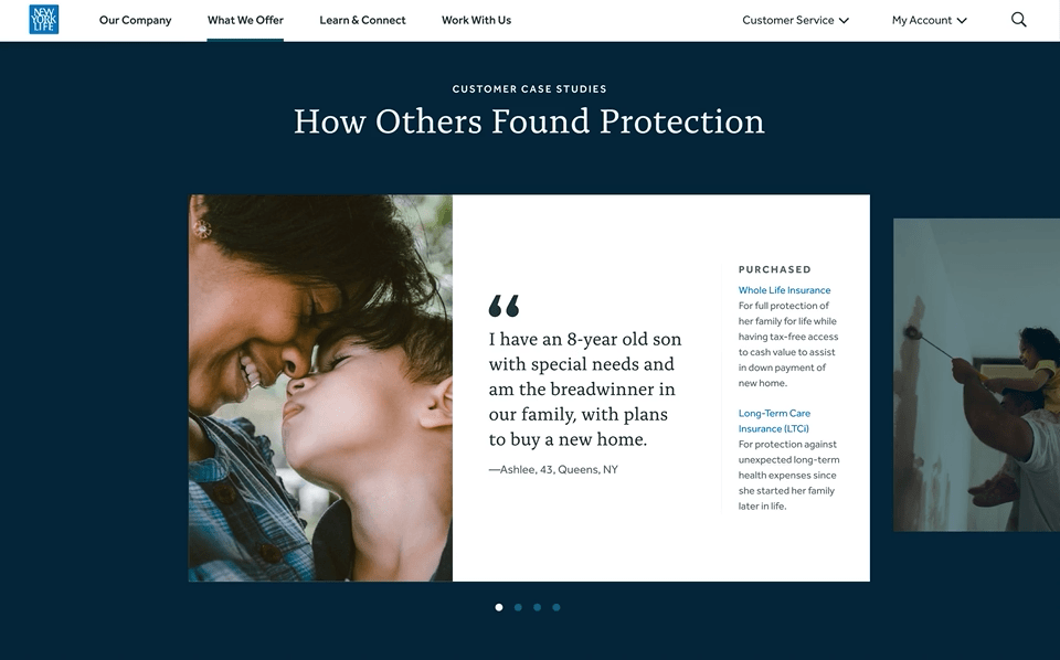
Design for delight & humanity
Thoughtful selection of inclusive, branded photography and secondary blues from the palette.

Money is never about money
Most people tend to have an emotionally complex relationship with their finances. Across the site, I designed solutions from a place of empathy that helped people relate each others' similar universal needs and easily discover relevant product(s).
RESULTS FROM VALIDATION RESEARCH
“It does a great job of delving into some of the differences without making it seem overwhelming."
Designing core product page templates
Architecting the right information
Meet people where they are with the right information, in the right moment.
Align experience with reality
How people research and discover products on the site complements how financial professionals advice clients.
Visual hierarchy to skim easily
Developed a type system, modular components, contextual groupings and ample white space.

Simplifying the complex
I designed the information in ways that made it easy for people to process, understand and compare between financial products.

RESULTS FROM VALIDATION RESEARCH
“The number one thing that is super helpful is this [product] comparison chart.”
STRATEGY AND CONCEPT DEVELOPMENT
Anticipating people's needs
To create an inclusive experience that's mindful of people coming to site at different stages of their product research and discovery, I developed a cross-linking strategy and designed concepts that enabled people to both
"Traverse across" content, and begin developing broad knowledge of offerings and financial terms.
"Drill down" content, and gain deeper understanding of offerings and terms, so they can narrow in on the best solution for their needs,


“They put resources into stuff like this? They're going to take care of me...I wish my insurance company had this level of interaction..."
NYL's CMO socialized the work with Senior Leadership, backed with strong validation from research, and received green light and funding to execute on Vision and Web Strategy. Argodesign won $13-million multi-year contract to develop new website, single largest contract in agency history.